
Those that follow my personal account on Twitter will be familiar with my weekly S&P 500 #ChartStorm in which I pick out 10 charts on the S&P 500 to tweet. Typically I’ll pick a couple of themes and hammer them home with the charts, but sometimes it’s just a selection of charts that will add to your perspective and help inform your own view – whether its bearish, bullish, or something else!
The purpose of this note is to add some extra context beyond the 140 characters of Twitter. It’s worth noting that the aim of the #ChartStorm isn’t necessarily to arrive at a certain view but to highlight charts and themes worth paying attention to.
So here’s another S&P 500 ChartStorm write-up!
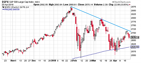
1. S&P500 Price Chart: First up is a look at a couple of key lines for the S&P500 price chart – the most notable is the downward sloping line as a series of lower highs have been registered.The second is the 200-day moving average, which so far has proven a “floor” to prices.The third, not shown, is the line which would show up around 2575, and if drawn would trigger most technical analysts to recognize a descending triangle pattern.The usefulness of triangle patterns like this are for setting clear lines in the sand to detect a breakout (in either direction). So keep an eye on these lines and levels in the days and weeks ahead.
Bottom line: Keep an eye on those lines in the sand.

2. The S&P500 vs Treasuries: This chart shows the S&P500 and IEF – a treasuries ETF. The point of showing it against this ETF is that it basically shows you the path of bond yields (inverted – since bond prices move inversely with bond yields). In late January/early February we saw the surge in bond yields coincide with the first major correction in a long time. What was more rare or notable was the fact that both bonds and stocks got sold-off. And for some it triggered memories of 1994, where a sustained and substantial selloff in bonds also made life difficult for stocks. And with the 10-year treasury yield on the verge of breaking out (my view is that it can definitely trade into the 3s, but will probably stop at about 3.5%), there’s more to this chart than you might initially think.


No Comments