• Entertainment
  • Finance
  • Marketing
  • Real Estate
  • Technology
  • Social
National Journal Community Of e-Experts
Finance 0

Stocks Trapped Between A Rock And A Hard Place Following Thursday’s Action

By Kurt Osterberg · On April 20, 2018

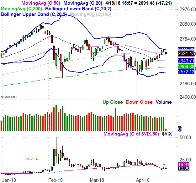
We’ve suspected for a while now that investors weren’t really as bullish as the quick look at the chart would suggest. Mostly, they’re indecisive, not really sure what to expect.

After Thursday’s closing bell rang, we know for sure. The S&P 500 topped exactly where we would have expected it to on Wednesday, but with Thursday’s loss, we can also see the bulls have drawn an important line in the sand right where we’d expect them to.

The daily chart of the S&P 50 below tells the tale. The upper Bollinger band (20-day, blue) halted the uptrend on Wednesday, forcing the pivot. The bears dished it out on Thursday… right up until the 50-day moving average (purple) was going to break or fail, as a floor. The bulls held the line there though.

It could be worse. At least the indices (this analysis doesn’t just apply to the S&P 500) are finding support at a pretty important level. Besides, we’d expect to see some resistance at the upper Bollinger band; stalling there doesn’t mean it won’t be hurdled. If we’re being completely unbiased though, the problem with the market now is the same problem it’s had for weeks. That is, there just isn’t a whole lot of committed interest in stocks right now.

It’s a difficult, subjective idea to objectify…. if you don’t have the right tools. We do have the right tools though, being able to plot the market’s daily “up” volume and “down” volume.

We’re not interested in that specific data, however. It’s too erratic by itself to analyze. To make better use of it we want to determine the trend of the two datasets. We can do so by applying moving averages of each data set.

That’s what you see on the bottom portion of the image below. The thicker, brighter green line is a moving average of the daily “up” volume, while the brighter, thicker red line is a moving average of the market’s “down” volume. When smoothed out like this, we can get a good feel for how traders really feel about stocks by figuring out what they’re actually doing with their money.

Print Friendly, PDF & Email

Share Tweet

Kurt Osterberg

You Might Also Like

  • Finance

    STEPN Sneaker NFTs Sell For $100, Previously Worth $1200

  • Finance

    NFT Prices in Free Fall – 5 NFT Collections to Start Buying Today

  • Finance

    5 NFTs Trending on Twitter Going Cheap to Invest in Now

No Comments

Leave a reply Cancel reply

Top Finance

  • 3 Best Large-Cap Blend Mutual Funds For Enticing Returns 3 Best Large-Cap Blend Mutual Funds For Enticing Returns
  • What is Value Chain Analysis? How to Deliver Value & Gain a Competitive Advantage What is Value Chain Analysis? How to Deliver Value & Gain a Competitive Advantage
  • Hedge Funds In The US Hedge Funds In The US
  • 5 Ridiculously Useful Non-Monetary Reward Examples that Improve Employee Engagement 5 Ridiculously Useful Non-Monetary Reward Examples that Improve Employee Engagement
  • Chart: Amazon’s Dominance In Ecommerce Chart: Amazon’s Dominance In Ecommerce

New Posts

  • STEPN Sneaker NFTs Sell For $100, Previously Worth $1200

    STEPN Sneaker NFTs Sell For $100, Previously Worth $1200

    June 20, 2022
  • NFT Prices in Free Fall – 5 NFT Collections to Start Buying Today

    NFT Prices in Free Fall – 5 NFT Collections to Start Buying Today

    June 20, 2022
  • 5 NFTs Trending on Twitter Going Cheap to Invest in Now

    5 NFTs Trending on Twitter Going Cheap to Invest in Now

    June 20, 2022
  • Bill Gates – ‘NFTs & Crypto Based on Greater Fool Theory’

    Bill Gates – ‘NFTs & Crypto Based on Greater Fool Theory’

    June 20, 2022
  • Actor Seth Green Pays $300,000 to Recover his Stolen BAYC NFT

    Actor Seth Green Pays $300,000 to Recover his Stolen BAYC NFT

    June 20, 2022
  • About
  • Contact Us
  • Privacy & Policy
  • Sitemap
  • Terms of use

Copyright © 2018-2021 NJCEE. All Rights Reserved.